Objective
The goal of the analysis is to provide updates to decision-makers at the state and local levels on how well social distancing interventions are working and for planning the roll-back of restrictions. Some of the mobility measures that could be helpful are:
- Aggregates (such as totals, percentage changes, lengths of travel etc.) summarising:
- travel within different tiles (1.2 km x 1.2 km spatial resolution) of the city (data currently available for Chennai).
- travel within different tiles (19 km x 19 km spatial resolution) in the state.
- travel from and to major travel hotspots in the country.
- percentage of population staying put (using baselines of mobility of the past).
- Aggregates summarising the overall changes in an area’s population.
Movement Patterns
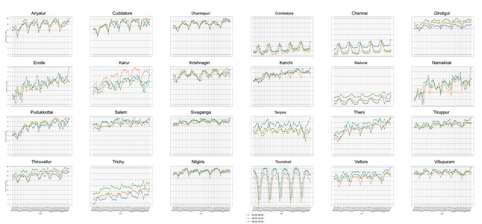
The lineplot here shows the daily percent change in mobility for major districts in Tamil Nadu starting from April 06. A unified increase in slope can be observed here which shows that compliance to lockdown measures is decreasing day-by-day.
Mobility Choropleth Maps
Choropleth maps allow us to visualize the mobility changes and attribute them to geographical regions. We mapped both the interdistrict mobility (movement between districts) and intradistrict mobility (movement within districts). Each map in a section shows mobility of a given day for each stage of lockdown. We can see that these maps also suggest an increase in mobility at present compared to previous stages of lockdown.
Interdistrict
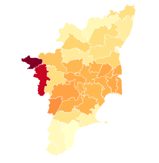
Lockdown 1.0
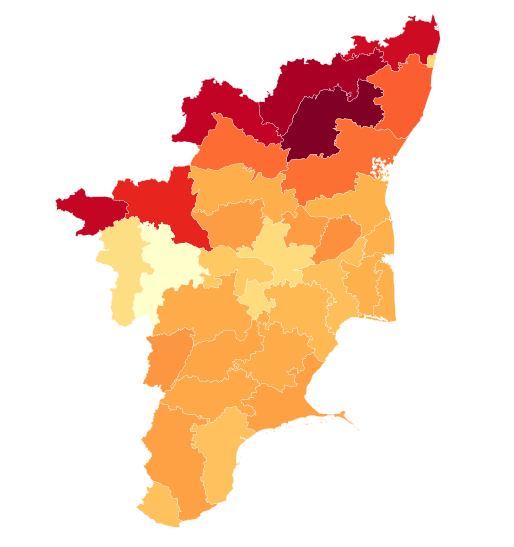
Lockdown 2.0
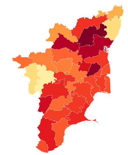
Lockdown 3.0
Intradistrict
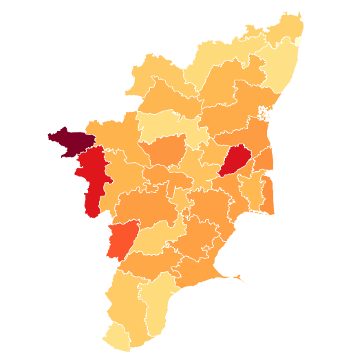
Lockdown 1.0
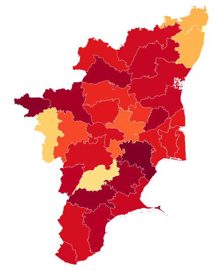
Lockdown 2.0
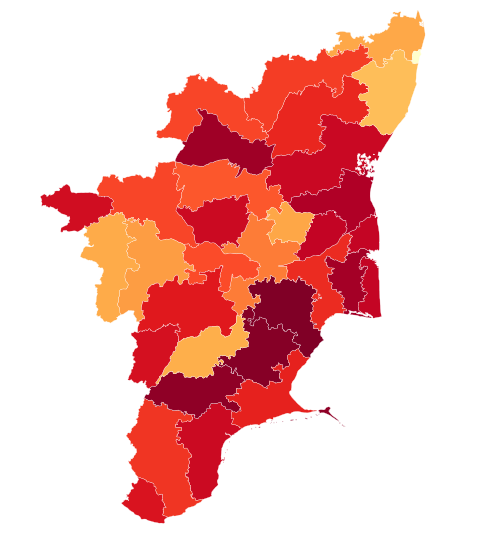
Lockdown 3.0
Apart from these, we also perform stay-put analyses to calculate the percentage of people staying at home. Such maps can inform us about lockdown compliance and amount of reduction in mobility
